
I'll admit... that pun was baaaad. But I do need your opinion on something, my dear reader.
With the release of Paul Cubbin's (Cubs on LAF and the proprietor of this cool Facebook page) painting "tutorial" for his Paras in Wargames Illustrated, I was inspired to paint some Paras. Actually I started painting one for fun a few days before spotting Cubs' posts on the LAF.
Paras are a fun army to paint... if it weren't for that Denison Smock. Cubs has a great technique involving the use of a glaze medium that I wanted to understand and use out of pure interest. Below you will see two miniatures that were painted with two more or less different techniques. The one on the left has the camouflage "blocked in" and traditionally highlighted, while the one on the right is emulating (poorly) the technique used by the very talented Mr. Cubbin. What intrigued me is the introduction of a bit of chaos and a random element, since you're never 100% how a glaze will apply or dry.
Now is where you come in... I am completely unsure with what technique to proceed. I've added a poll here and I hope you may tell me if you like the Denison Smock on the left or on the right better. You will find the poll directly under the pics.
Looking at these minis I've also realised that I need to rethink the metal parts on the rifles. Looks too light for my taste.
Which Denison Smock realisation do you prefer?
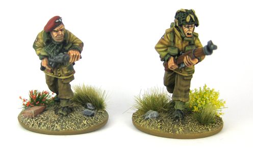
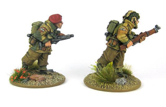
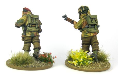
With the release of Paul Cubbin's (Cubs on LAF and the proprietor of this cool Facebook page) painting "tutorial" for his Paras in Wargames Illustrated, I was inspired to paint some Paras. Actually I started painting one for fun a few days before spotting Cubs' posts on the LAF.
Paras are a fun army to paint... if it weren't for that Denison Smock. Cubs has a great technique involving the use of a glaze medium that I wanted to understand and use out of pure interest. Below you will see two miniatures that were painted with two more or less different techniques. The one on the left has the camouflage "blocked in" and traditionally highlighted, while the one on the right is emulating (poorly) the technique used by the very talented Mr. Cubbin. What intrigued me is the introduction of a bit of chaos and a random element, since you're never 100% how a glaze will apply or dry.
Now is where you come in... I am completely unsure with what technique to proceed. I've added a poll here and I hope you may tell me if you like the Denison Smock on the left or on the right better. You will find the poll directly under the pics.
Looking at these minis I've also realised that I need to rethink the metal parts on the rifles. Looks too light for my taste.
Which Denison Smock realisation do you prefer?

7 comments:
Hi,
it's a bit difficult. I think both look nice and I really had to take some time to be able to choose. In the end I went for the one on the right, I think it looks a bit more realistic, like the camo was printed on the fabric, whereas for the left one it looks more like the uniform was made from scraps of differents colors of textile. I think I liked the left one because my eye is more used to seeing this way of painting camo.
So for me the one on the right with the glazes!
Thanks for posting, your minis are a real pleasure to the eye!
Cheers,
MarK
jomada-adventures.blogspot.de
I feel the one on the left is more realistic...sorry but for 28mm it just looks better. Cammo pattern does not fade out...I spent 10 years wearing it in my day job although the modern digital stuff would look good painted with the technique on the right.
By the way either would look fine as your brushwork is excellent.
They both look superb, but I prefer the one on the left.
Christopher
Both are great but I like the right one most. It looks a bit more like a faded and worn piece whilw the left one looks like fresh out of the uniform store.
Thank you for the kind words, guys!
There definitely is a very clear lead for the one on the left at the moment. It seems that the glazing method is something that I haven't grasped completely yet and I also believe that it fits Cub's painting style much better than mine.
@Solo: Thank you for sharing your professional experience! Very valuable. Here though I think the glaze is used less to show fading but rather the fact that it was splotched on with a large brush rather than it being printed on.
But I am glad that it's a tough decision for some of you as well. For me it was a head-burner.
Oh and of course: Thank you all for helping me out with this!
Well, over double as many people prefer the left example... Definitely a clear majority. I thought it would have been more of a close call.
Post a Comment